Summary
This project was completed for a real DTC e-commerce client (anonymized here due to NDA). The client’s product detail page (PDP) was underperforming with low add-to-cart rates. I redesigned the PDP across desktop and mobile to simplify customization, clarify product info, and improve visual hierarchy.
A/B testing results were as follows:
10% lift in conversions | $1.3M predicted annualized revenue gain
gloop | PDP redesign
gloop | PDP redesign
my role:
UX Researcher
UX Designer
methods:
Heatmap & Session Recording analysis
tools:
Figma
Lyssna
Hotjar
platform:
Desktop
Mobile
Project Overview
The client is a well-known brand selling plant-based, meal replacement shakes to users looking to improve their health. Our goal for this project was to minimize friction on the product page by better matching user expectations, providing users with a more conventional, streamlined shopping experience.
A/B testing results of the redesigned product page showed a 10% lift in conversion rates over the control at over 90% statistical significance, with $10,000 added revenue and a predicted $1.3m annualized revenue gain.
Client Goals
Increase AOV
Increase product subscriptions
Reduce abandonment & minimize friction
Challenges
Unconventional product page layout
Research uncovered mismatch in expectations
Users dropping off on product page
01 Research Findings
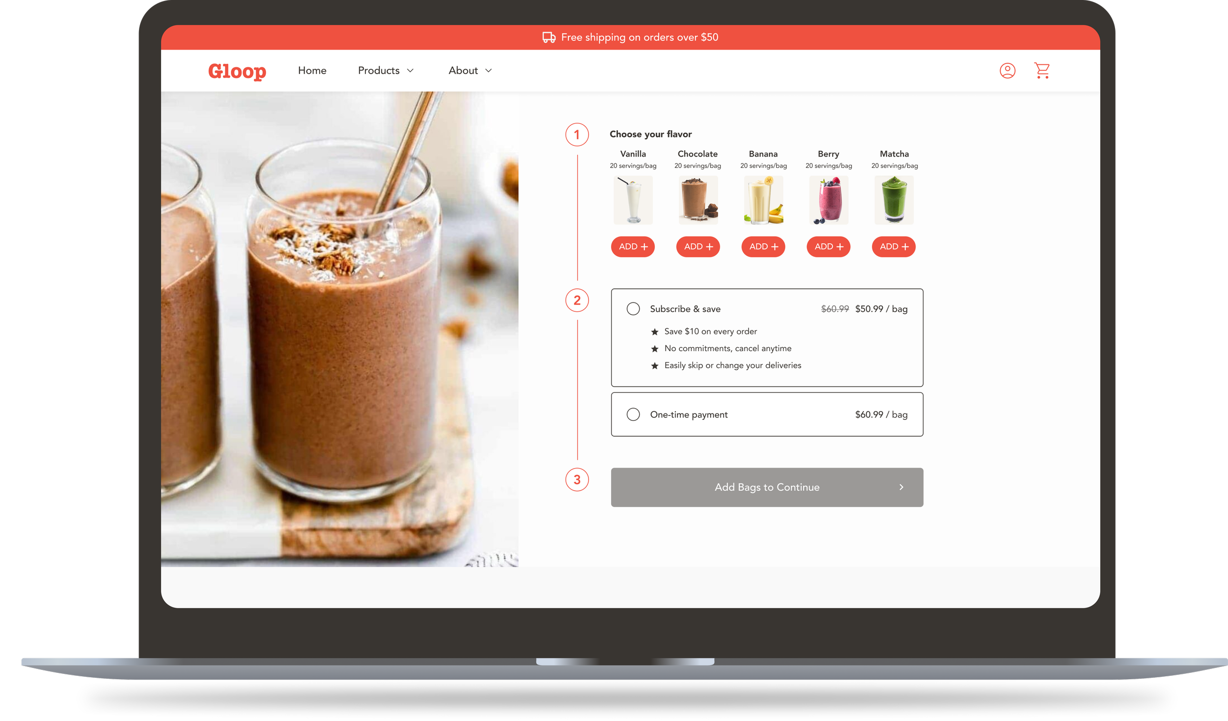
Heatmap Analysis
Confusing Add Flow
Users clicked flavor “Add” buttons instead of the main “Add to Cart,” indicating they misunderstood how to complete a purchase.
Hidden Product Info
Clicks on flavor thumbnails suggested users expected more details, but none were provided.
Session Recordings
Rage Clicking
Users repeatedly clicked flavor “Add” buttons, believing these added items to the cart rather than adjusted quantities.
Unclear Selections
Many scrolled back and forth in the buy box, unsure if their flavor and purchase choices had been saved.
Missing Details
Users clicked on flavor images seeking more information, highlighting gaps in accessible product details.
04 Design Rationale
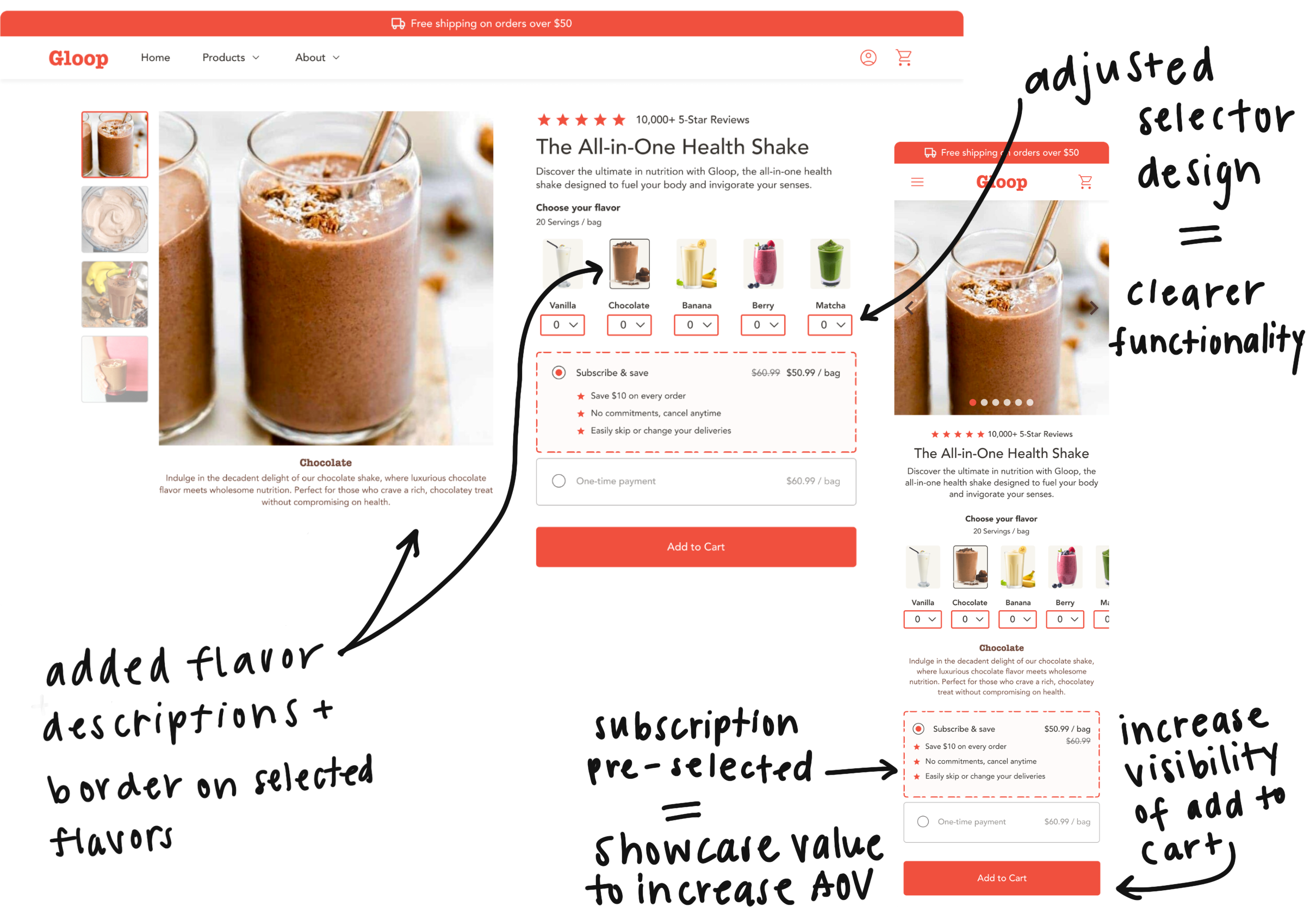
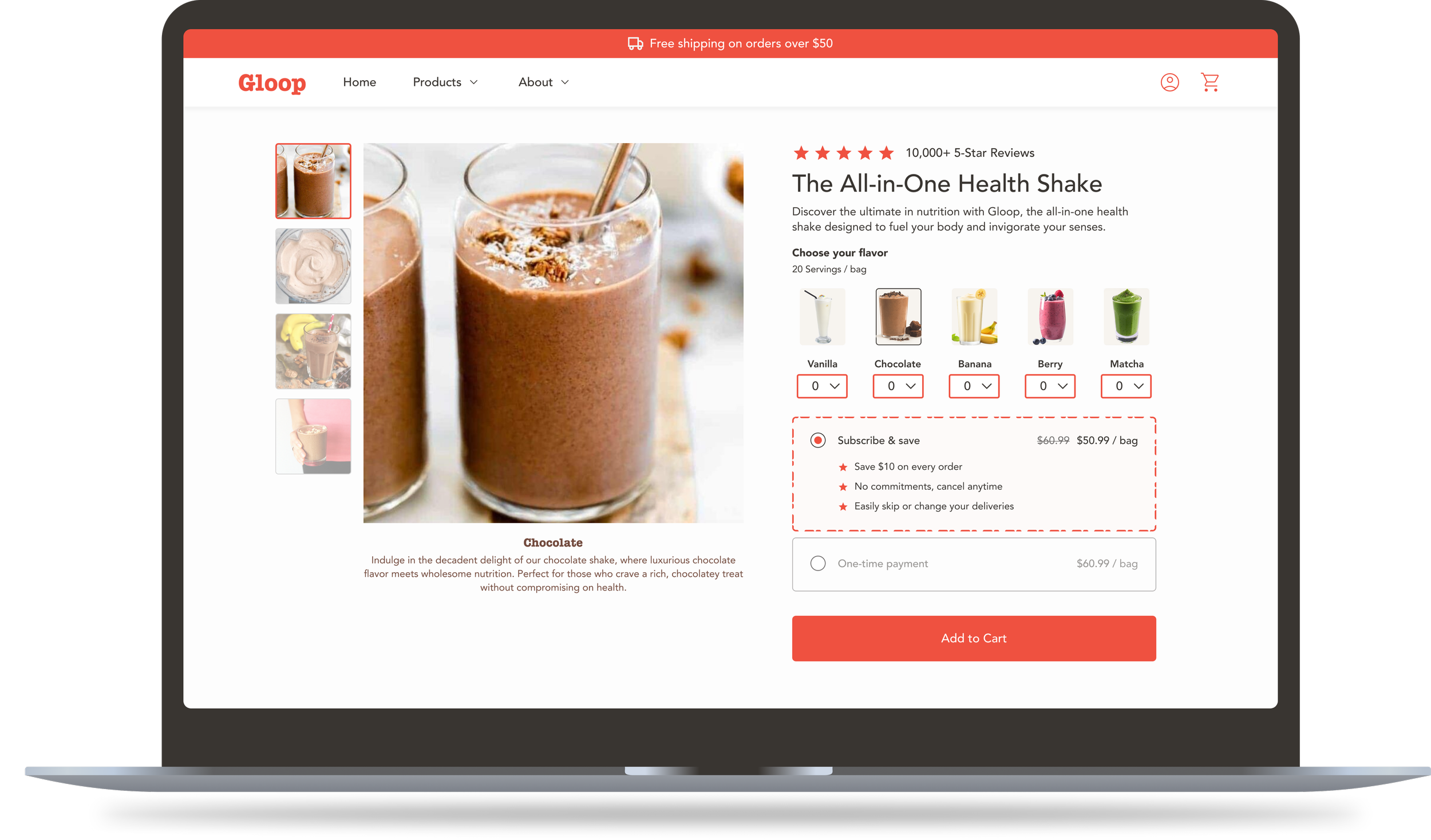
The discovery research highlighted several pain points in the original PDP that guided my design decisions.
Flavor Selection:
Replaced confusing “Add” buttons with clear quantity selectors and borders to confirm user choices.
Purchase Options:
Pre-selected the subscription plan to increase visibility of benefits, leading to more subscription purchases.
Product Information:
Added short flavor descriptions so users could compare options without extra clicks.
Primary Action:
Enhanced the prominence of the “Add to Cart” button to guide users confidently to checkout.
Together, these changes were designed to better align with user expectations, reduce cognitive load, and highlight the value of subscriptions — improving both the usability of the PDP and the business outcomes tied to it.
A/B Testing
Once the design incorporated additional feedback and was approved by the client, it was handed off to development for A/B testing. The test was closed after 2 weeks of being live on the site, with results as follows:
10% Increase
in conversion rate over the control
$1.3 million
predicted annualized revenue gain
With a statistically significant increase in conversion rates, we suggested the client implements the updated design in their site experience.
More Case Studies
