illumi | collections page redesign
illumi | collections page redesign
Summary
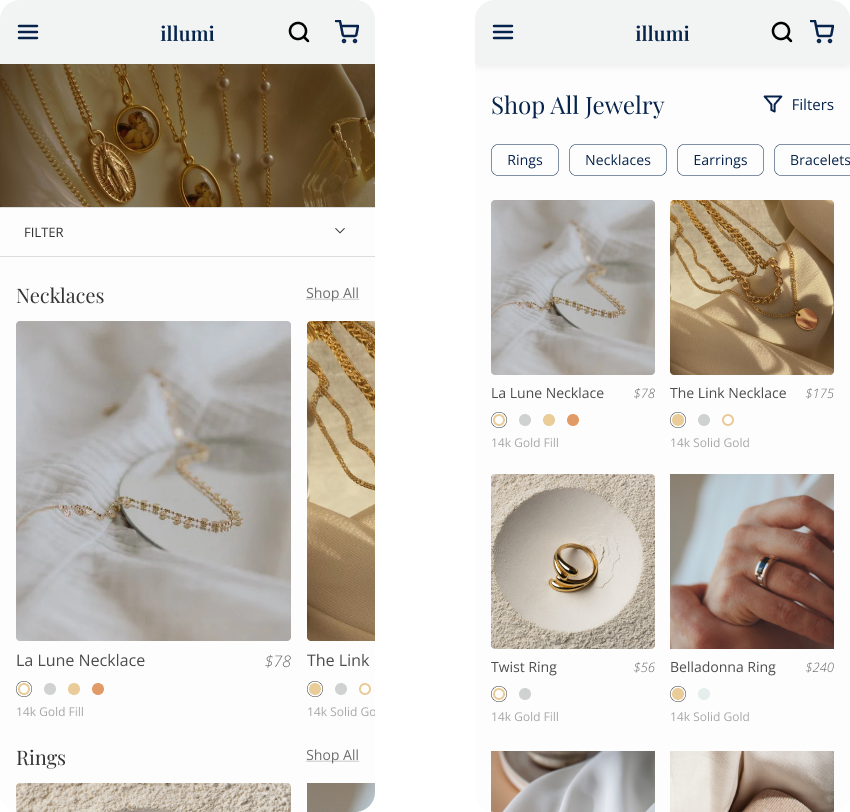
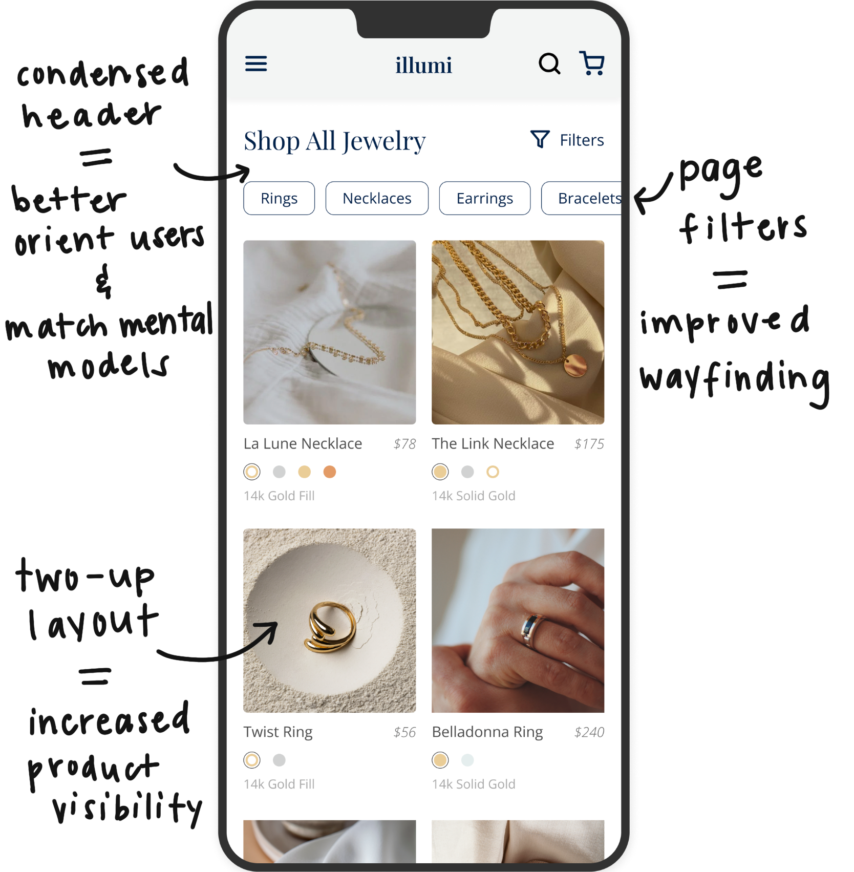
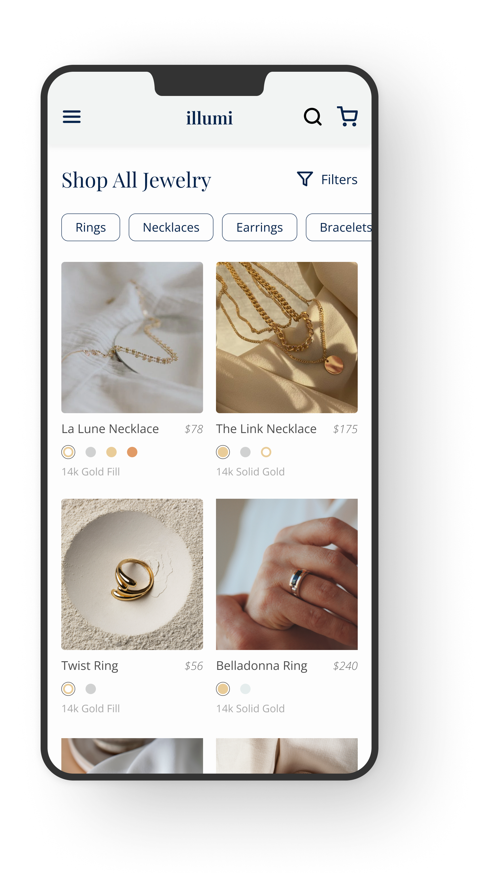
This project was completed for a real DTC e-commerce client (anonymized here due to NDA). The client struggled with product discoverability due to a single-column layout and buried items in carousels. I redesigned the collections page across desktop and mobile, introducing a two-up grid for increased visibility, a condensed header for orientation, and persistent filters for streamlined browsing.
A/B testing results showed a 6% lift in conversions at 90%+ statistical significance, with a $90K predicted annualized revenue gain.
tools:
Figma
UserTesting & Lyssna
Hotjar
platform:
Desktop
Mobile
methods:
User testing
Session & Heatmap Analysis
my role:
UX Researcher
UX Designer
Project Overview
The client for this project is a high-end, online jewelry store that sells an array of products from affordable jewelry to heirloom pieces. Our goal was to streamline the browsing experience on collections pages, improving wayfinding and discoverability of relevant products to increase purchase confidence and readiness.
A/B testing results of the redesigned collections page showed increased positive sentiment, as well as a 6% lift in conversion rates at over 90% statistical significance and $90,000 predicted annualized revenue gain.
Client Goals
During initial client meetings, we uncovered their top business objectives, including:
Increase adds to cart, decrease bounce rate.
Better understand how users shop on their site.
Remove friction with the personalization tool and on the site in general.
User Goals
We also conducted rigorous user testing and identified three prominent user goals:
Facilitate meaningful gift-giving experiences.
Enable budget-conscious shopping.
Discover high-quality heirloom products, cherished for their sentimental value.
Challenge
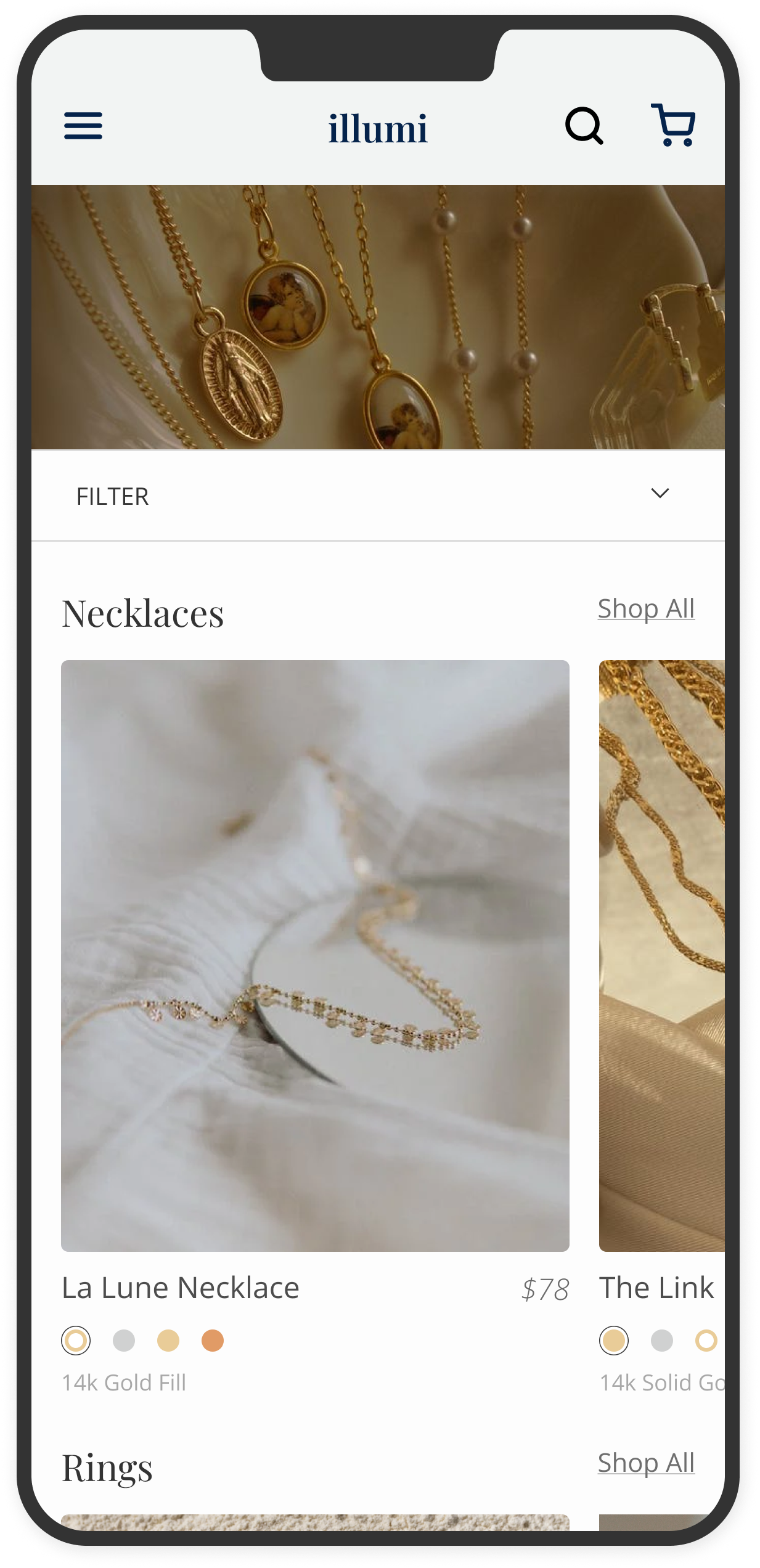
User testing, heatmap and session recording analysis uncovered several pain points throughout the shopping journey, but one main challenge stood out - the browsing experience created friction due to the categorization of product cards on collections pages, making it difficult for users to easily find relevant products of interest, which led to user testers expressing frustration and mentioning they would abandon the site.
01 Research
User Testing
Slow to Browse
Single-column layout required excessive scrolling, making browsing feel slow and cumbersome.
Buried Products
Category carousels hid items too deeply, causing many products to be overlooked.
Abandonment
Frustration led users to leave the page or rely on search instead of browsing.
Session Recordings
‘Shop All’ Backtracking
Users frequently clicked “Shop All,” then backtracked to collections, creating unnecessary effort.
Cognitive Load
Backtracking slowed product discovery and made browsing feel taxing.
Filter Confusion
Many opened the filter panel but abandoned it quickly, showing uncertainty in how filters worked.
Heatmap Analysis
Above-the-Fold Bias
Engagement dropped sharply after the first few rows, with little interaction in deeper carousels.
Ignored Carousels
Category carousels received little to no engagement, indicating low visibility of items.
Filter Drop-Off
High clicks on the filter icon but low follow-through suggested the design didn’t meet user expectations.
02 Design Rationale

03 Preference Testing
To minimize friction on collections pages, a new design was proposed that would provide users with more autonomy in their shopping journey, while increasing category exposure and providing refinement opportunities that would aid users in finding a product of interest.
We recruited a pool of 30 qualified participants through a remote user testing panel — participants were shown both the control and variant designs, asked to select which design they prefer, then given follow-up questions.

04 Results
Rapid testing results revealed that 70% of participants favored the variant design over the control at 99% statistical significance.
Participants who preferred the variant appreciated the mobile-friendly layout and added quick filters at the top of the page, noting they were able to more easily see all products and quickly navigate the page in the updated design.
“I like the consistent structure of the second option: just a list of items, no categories. It allows me to see all items so I won’t miss anything.”
“The way the filters are placed and the rings are displayed are easier to browse and overall more pleasant.”
Positive sentiment and higher user satisfaction towards the variant suggests the updated design shows potential for significant success and should be prioritized for further development and implementation.
A/B Testing
Proving successful in preference testing, the variant was prioritized for development in A/B testing. The test was closed after a month of being live on the site, with results as follows:
6% Increase
in conversion rate over the control
$90,000
predicted annualized revenue gain
With a statistically significant increase in conversion rates, we suggested the client implements the updated design in their site experience.
More Case Studies
