
Giant Bicycles | improving the product detail page
Giant Bicycles | improving the product detail page
Summary
This project was completed for Giant Bicycles, a global bicycle manufacturer and retailer, where unclear availability messaging, inconsistent fulfillment logic, and an unintuitive purchase path caused riders to hesitate or assume products couldn’t be purchased online. I led research and design across desktop and mobile to surface availability earlier, clarify fulfillment options (delivery, local pickup, notify me), and guide users through a clear, predictable purchase flow—reducing ambiguity and supporting more confident decision-making.
All designs shown reflect publicly visible interfaces. Sensitive data, internal metrics, and proprietary implementation details have been omitted.
tools:
Figma
UserTesting & Hotjar
Lyssna
platform:
Desktop
Mobile
methods:
User Testing
Behavioral Analysis
Validation Test
my role:
UX Researcher
UX Designer
Project Overview
This project focused on improving the Product Detail Page (PDP) experience for a global bicycle retailer to reduce friction, clarify availability and fulfillment logic, and support confident purchase decision-making. Over a 2–3 week period, I led PDP-focused research and design end-to-end, conducting behavioral analysis, user testing, and validation to synthesize insights into actionable recommendations.
I partnered closely with strategy, product, and engineering stakeholders to align on opportunity areas, translate findings into logic flows and design concepts, and validate solutions within technical constraints as part of a larger, multi-workstream engagement.
Client Goals
During early discovery, the client aligned on a set of goals focused on:
Reducing friction in the bike shopping journey to support conversion readiness
Increasing buyer confidence in high-investment purchase decisions
Aligning the PDP experience with the Local Bike Shop (LBS) fulfillment and pickup model
Identifying experience gaps that delay commitment or suppress purchase readiness
Challenge
Behavioral analytics showed that over 50% of user sessions began on Product Detail Pages (PDPs), yet those same pages had the highest exit rates. User testing revealed that unclear availability messaging, inconsistent fulfillment logic, and an unintuitive purchase path caused riders to hesitate or assume products couldn’t be purchased online. As a result, PDPs—rather than building confidence—often became a point of friction that delayed or prevented purchase commitment.
Research Qs and Focus
01
Where do riders experience friction or hesitation during bike selection?
02
What information do riders need to feel confident moving forward?
03
How well does the current PDP match riders’ expectations for buying online vs in-store?
01 Research | Behavioral Analysis
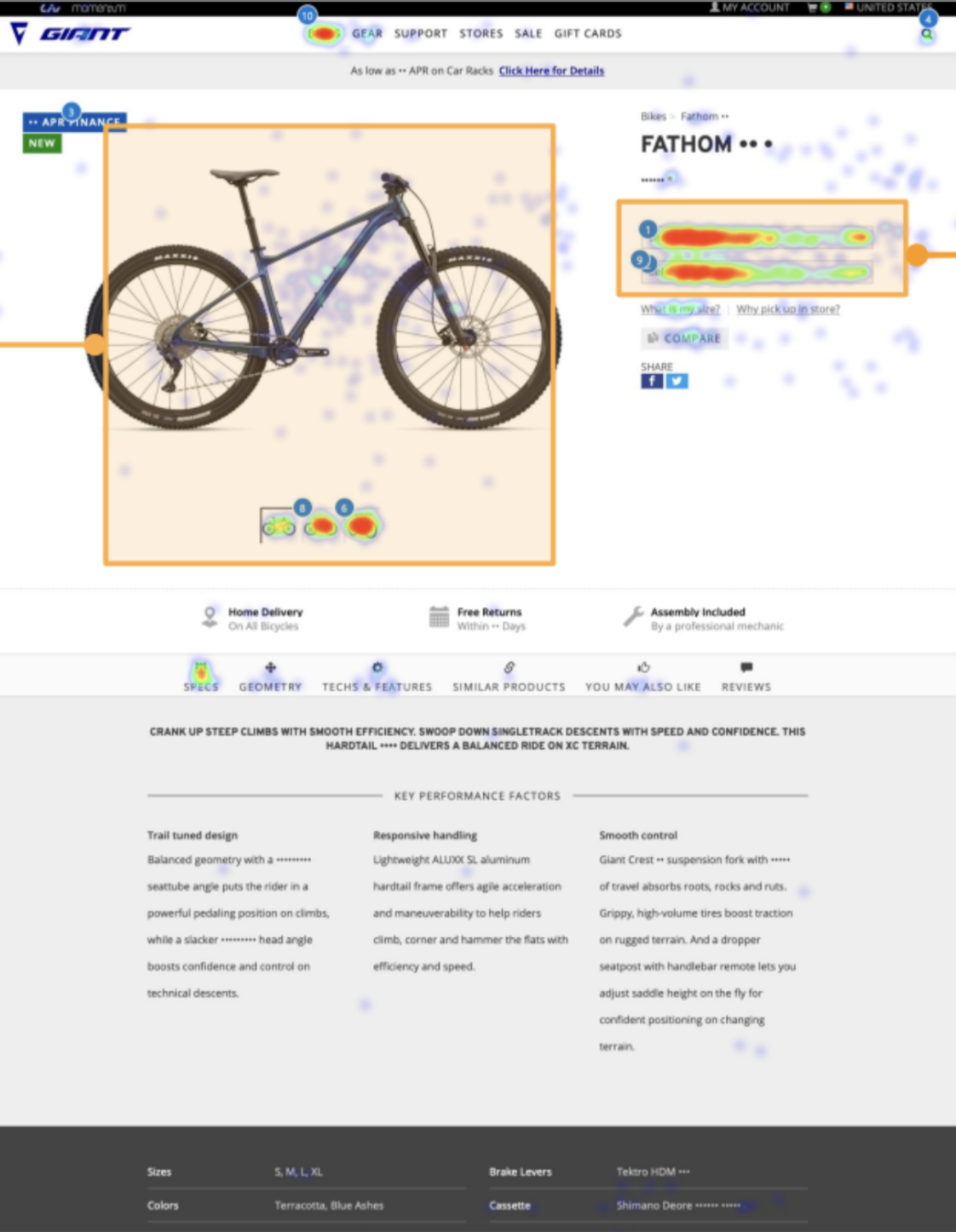
Session Recordings
Size Selector Reliance
Users repeatedly interacted with the size selector, often cycling through options to uncover availability info.
Backtracking & Uncertainty
Switching between size option, availability states, & imagery signaled confusion about next steps and purchasing ability.
Rage Clicks on “Unavailable”
Frustrated clicks on unavailable messaging suggested unclear outcomes and a lack of guidance when options couldn’t be fulfilled.
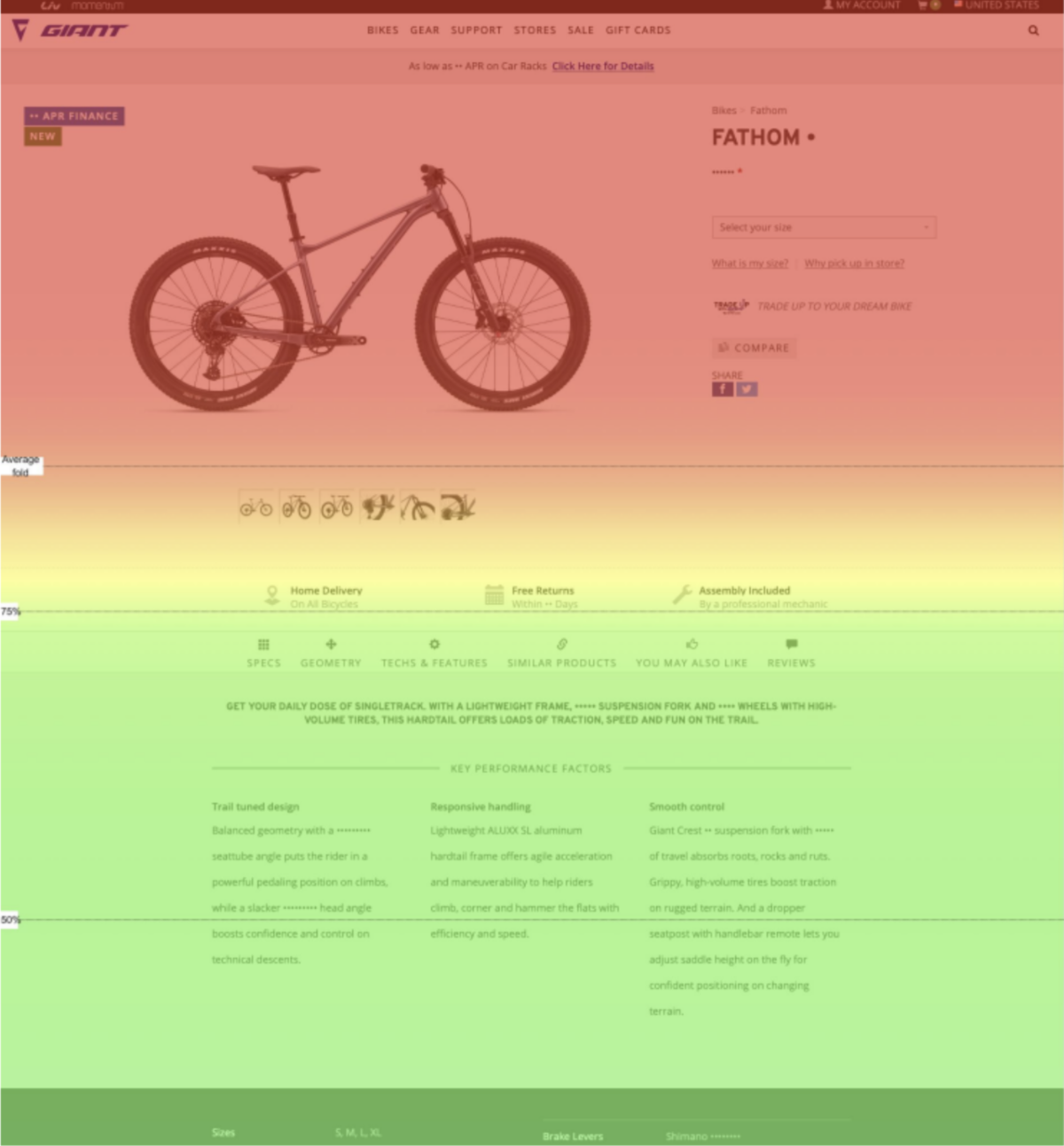
Heatmap Analysis
Above-the-Fold Bias
Engagement was heavily concentrated above the fold, with key decision behaviors happening before users scrolled—suggesting critical info needed to appear earlier.
Ignored Lower Content
Deeper PDP content received minimal attention, indicating that users either didn’t expect key information below the fold or didn’t perceive value in continuing to scroll.
01 Research | User Testing — Persona Building
This exploratory user test was conducted to understand riders’ motivations, decision-making styles, and points of friction within the current Giant experience. From these sessions, three distinct behavioral patterns emerged.
Participant Criteria
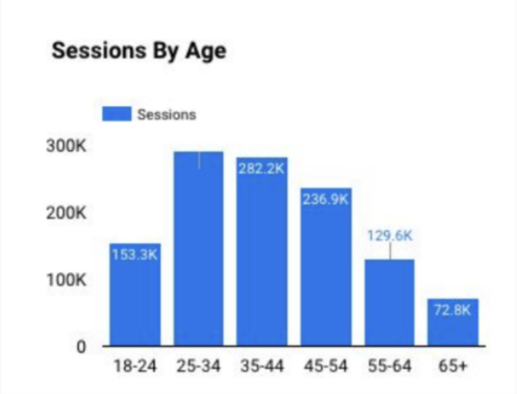
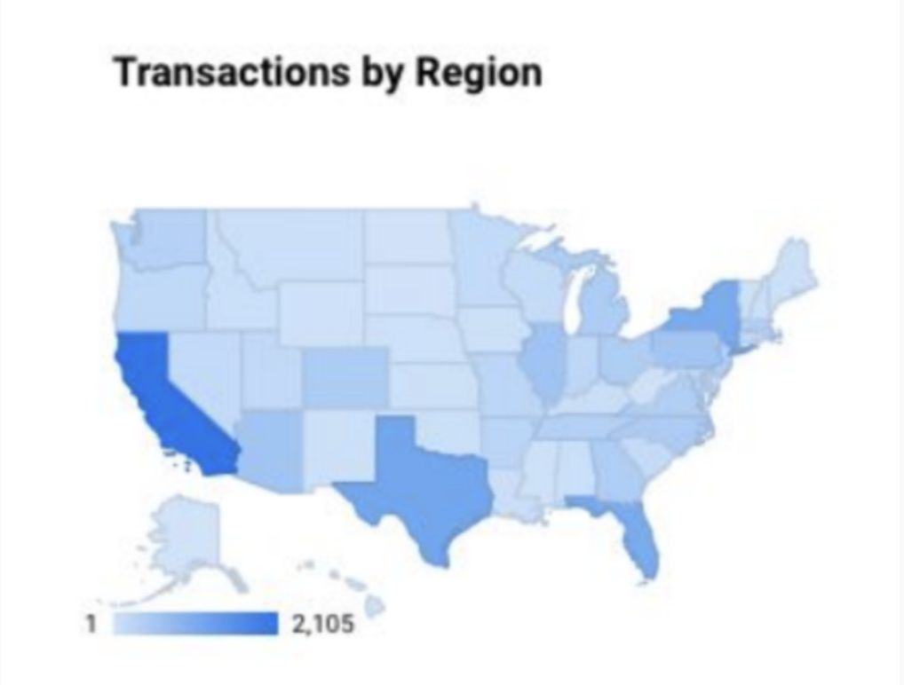
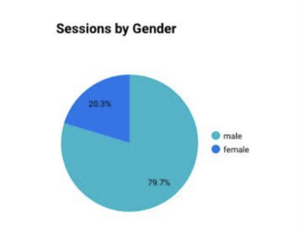
Lean, 5 person user test aligned with Giant’s typical shopper demographic:
Ages 25–54 , mostly male, located in the US
Purchased a bike in the last 2 years
Familiar with top bike brands, including Giant
Shops on mobile and desktop
Mix of beginner → intermediate bike knowledge
Finders | Purpose-Driven
Clear bike and use case in mind
Feature + spec–focused
Quick, efficient decision-makers
Need clear sizing + availability
“I was looking for a very specific bike to use for basically riding pump tracks and also dirt jumping…” — User Tester
Technical | Criteria-Driven
Specific technical requirements
Specs-first evaluators
Detail-oriented, confident shoppers
Need transparent technical info
“The frame material and suspension are factors I consider in buying a bike… Everything I get is hardtail.” – User Tester
Searchers | Exploratory
Unsure which bike fits needs
Benefit-focused; need guidance
Compare to understand differences
Need simple recs
“I have a Huffy… I'm not exactly sure what kind… I mainly wanted to start exercising more… and get outside.” – User Tester
02 Findings |
User Testing + Behavioral Analysis

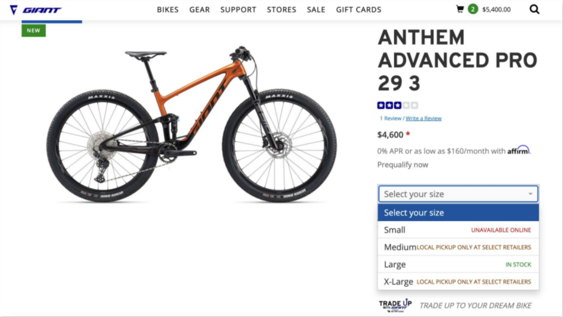
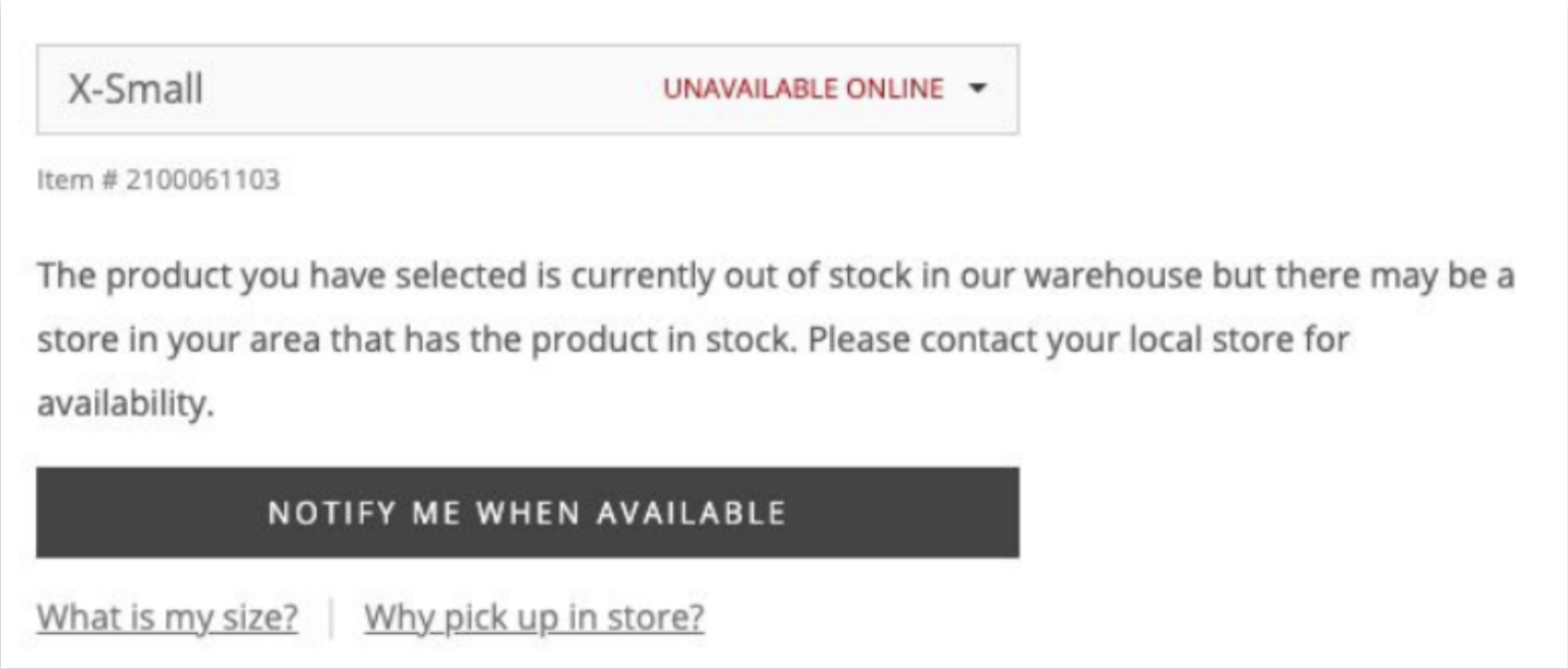
Buried Product Availability
Availability is hidden behind interactions and unclear labels, leading users to assume products can’t be purchased—even when options exist.
High-intent buyers work too hard to interpret availability & next steps.
Evidence
Users cycled through size/color options to infer availability
“Unavailable Online” stopped further exploration
Store pickup and “Notify Me” options were often missed
“Well I need extra large, so I guess I’m out of luck.” – User Tester
Unclear Fulfillment Options
Users lack a clear mental model for fulfillment, breaking confidence and causing them to assume options are unavailable.
Evidence
Users clicked through multiple size/color combinations to infer fulfillment options
“Unavailable Online” was misread as fully unavailable
Local pickup, pre-order, and Notify Me options were rarely recognized
Unclear Purchase Path
The purchase path isn’t visible or intuitive, which adds friction at moment users want to convert.
Searchers and Finders struggled to identify the next step, slowing momentum or causing drop-off.
Evidence
Heavy interaction w/ product images, low engagement with purchase actions
Add to Cart hidden until size/color selection
Users searched the page for how to proceed
“Where would I go to actually purchase?” – User Tester

03 Design Opportunities
Behavioral analysis and user testing exposed where users lost confidence and momentum, pointing to clear opportunities to reduce friction and clarify the path to purchase:
Surface availability earlier to support confident decision-making
Clarify purchasing pathways across all availability states
Use action-oriented messaging to guide next steps (e.g., pickup, pre-order, notify)
Standardize availability and fulfillment language to reduce misinterpretation
Make next steps explicit with clear CTAs and visual progression cues
Reduce cognitive load by prioritizing only relevant actions and information
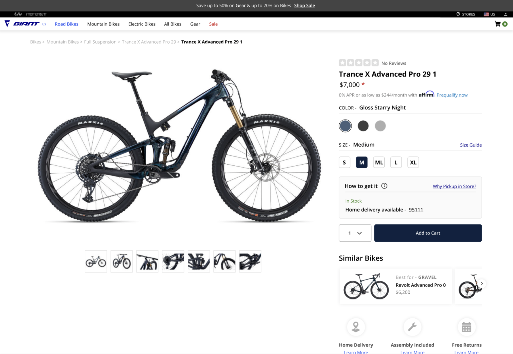
04 Design Concepts
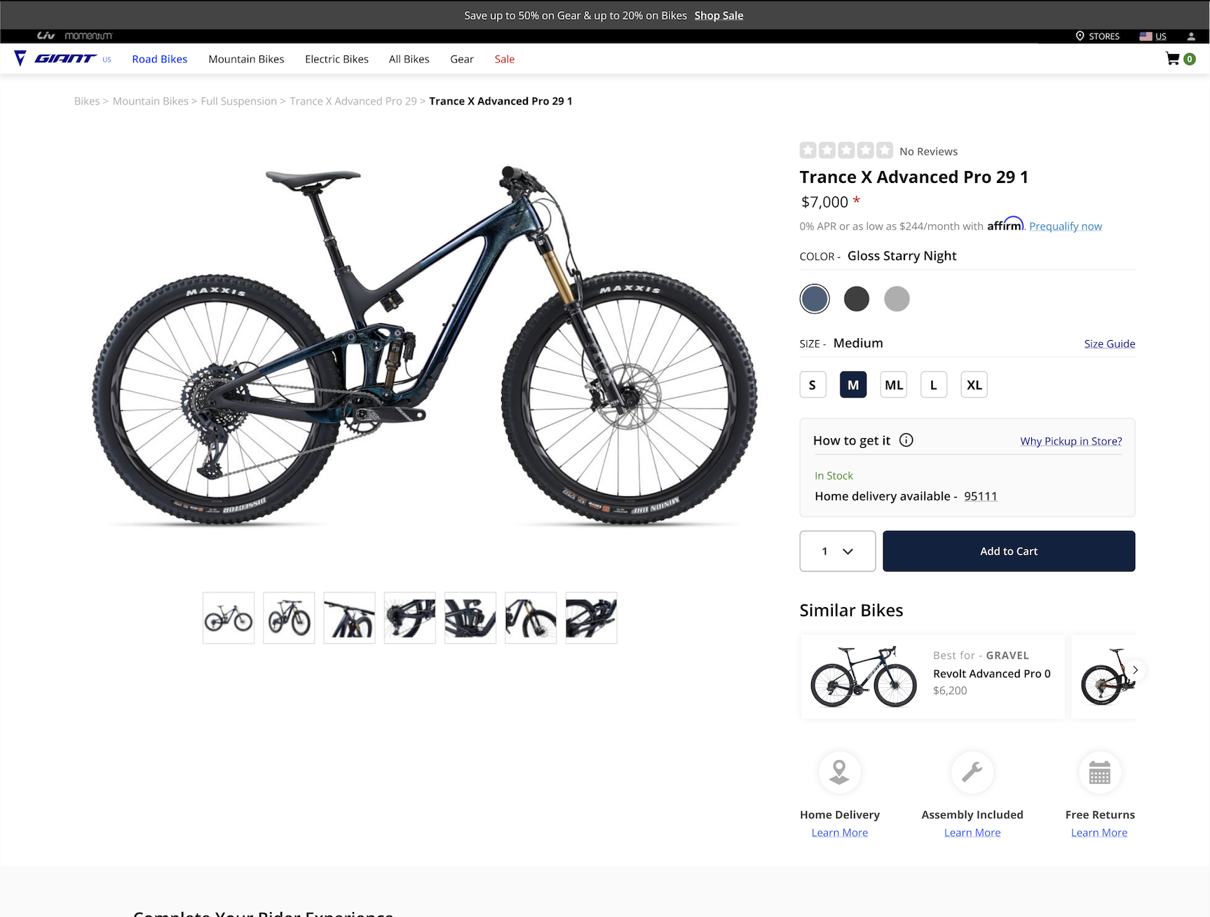
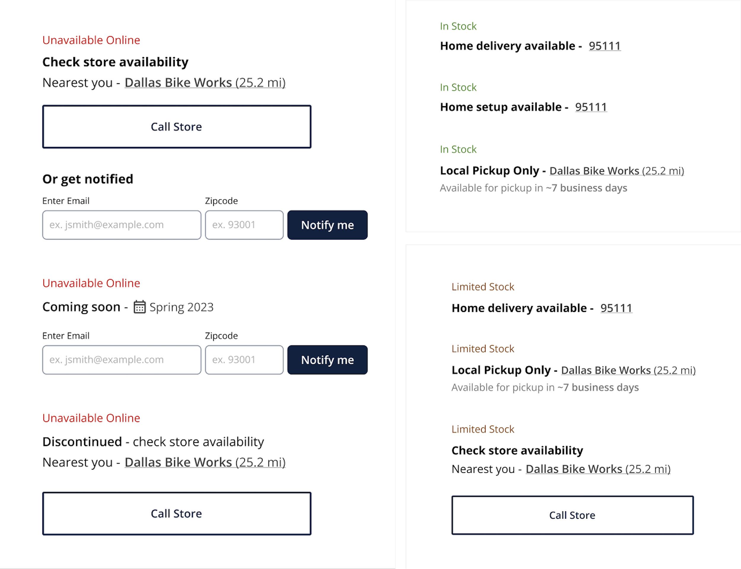
Users struggled to find availability, misread “Unavailable Online,” and assumed products couldn’t be purchased.
Solution 1 | Guide Users Through Clear Purchase Pathway
Surface availability as the first, predictable step in the purchase path
Standardize availability labels (“In Stock,” “Limited Stock,” “Unavailable Online”) with clear definitions
Localize availability messaging immediately after size/color are selected
Users didn’t know how to proceed — clear CTA wasn’t visible until selections were made, causing confusion.
Solution 2 | Guide Users Through Clear Purchase Pathway
Guide users through two clear steps: 1) Pick size/color → 2) Enter location → 3) Availability + Add to Cart
Standardize “Check Availability” as a consistent gateway action
Reduce cognitive load by only revealing actions when relevant
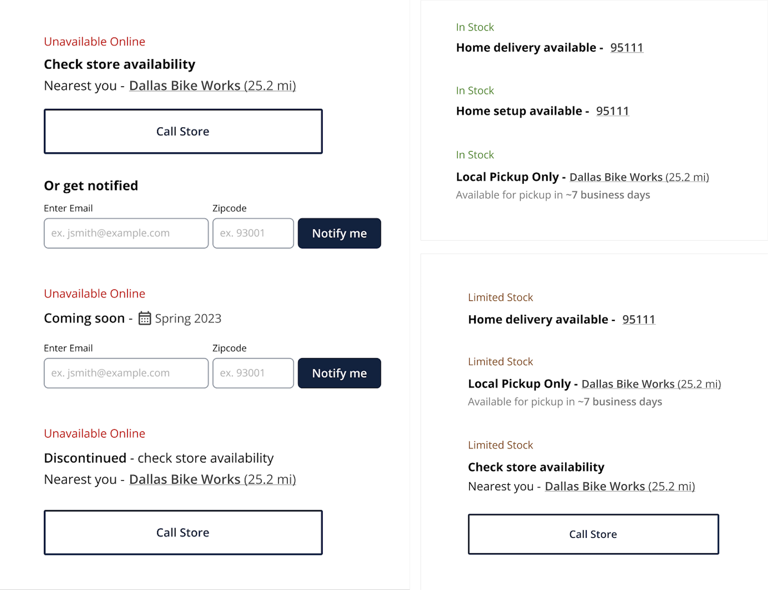
Users lacked a mental model for fulfillment options and interpreted local pickup as a second-best or unavailable option.
Solution 3 | Guide Users Through Clear Purchase Pathway
Clear, consistent states for each fulfillment path (delivery, pickup, setup, preorder, discontinued)
Add micro-explanations (e.g., pickup timing estimates, delivery ZIP code, store distance)
Introduce “Get Notified” flows for Coming Soon + Out of Stock
05 Technical Feasibility
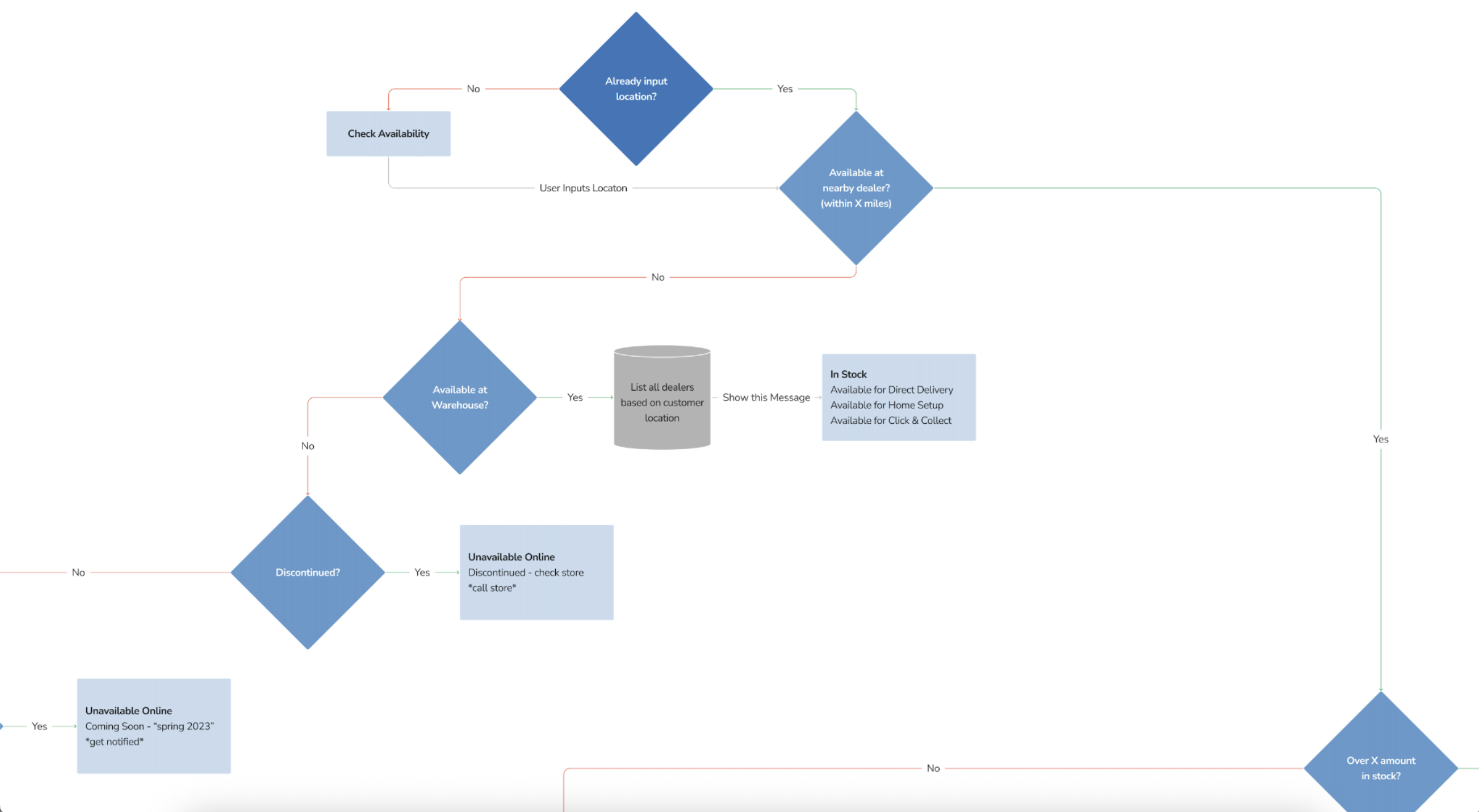
The Problem
Early design concepts exposed technical ambiguity around fulfillment behavior, making it clear we couldn’t confidently define the UI without understanding how the backend actually determined availability.
Giant’s PDP was built on legacy catalog logic that wasn’t designed for modern e-commerce, and as new fulfillment options were layered on, availability rules became fragmented—surfacing as inconsistent messaging and unclear next steps for users.
Why a Logic Map?
Fulfillment rules weren’t documented
Availability states behaved inconsistently
No shared reference across teams
What I Did
Worked w/ developers + product
Audited backend fulfillment rules
Mapped all availability states
Validated logic cross-functionally
How the Logic Works
ZIP code gates localization
Inventory checks determine eligibility
States unlock fulfillment options
UI behavior follows this first decision layer
The Impact
The logic map became a single source of truth that aligned design, engineering, and QA. It enabled consistent PDP behavior, reduced user confusion around availability, and directly supported purchase confidence and conversion.
06 Validation Testing
With the fulfillment logic aligned to technical constraints, we ran a lean round of validation testing—preference testing, first-click testing, and confidence ratings—to de-risk the redesigned PDP. These methods allowed us to pressure-test whether the new layout felt more intuitive, helped users identify the next step faster, and increased confidence at the moment of purchase before moving into build.

Control PDP

Variant PDP
07 Results
Preference Testing
78% of participants preferred the redesigned PDP
Users described it as more intuitive, cleaner, and more familiar
Feedback aligned with modern e-commerce mental models
Reduced cognitive effort compared to the control experience
Directional signal that the redesign better matched user expectations.
First Click Testing + Confidence Ratings
Avg. time to find Add to Cart:
Redesign: ~8 seconds
Control: ~30 seconds
Clear hierarchy made the next step immediately recognizable
Users spent less time scanning or hesitating
Confidence Ratings
Redesign users reported higher confidence taking the correct action
Control users often questioned whether they were “done”
Reduced ambiguity at a high-consideration moment
Why This Mattered
Across tests, the redesigned PDP consistently reduced friction and uncertainty at key decision points. Users moved from selection to action more intuitively and felt more confident they were taking the right next step. While not statistically definitive, these signals gave the team confidence the design was solving the right problems and was ready to move into implementation and deeper testing.
Deliverables
The Giant team received final PDP designs (desktop and mobile), a unified fulfillment logic map, availability and CTA behavior specifications, interactive prototypes used for validation, and detailed handoff documentation to support engineering and QA implementation.
08 Impact | Shipped Experience
What Shipped
Redesigned PDP launched with new layout, sizing flow, and unified availability logic
Minor CTA adjustment at launch (“Add to Cart” vs. “Check Availability”)
Fulfillment logic map adopted as the shared source of truth across product, engineering, and e-commerce
Team and System Impact
Reduced ambiguity across teams → faster development and easier QA
Consistent availability behavior across all fulfillment states
Foundation for future experimentation (A/B testing, personalization, optimizing “How to get it” states)
User Impact (Validated)
Lower cognitive load through earlier availability surfacing and clearer hierarchy
Faster action discovery and higher confidence during purchase decisions (validated via testing)
Clearer next steps across delivery, pickup, preorder, and notify flows
Expected Business Outcome
While post-launch analytics weren’t available, validation results and prior pain points suggest improved add-to-cart rates, reduced time-to-CTA, increased engagement with size/availability selectors, and fewer support inquiries tied to fulfillment confusion.
More Selected Work
-
![]()
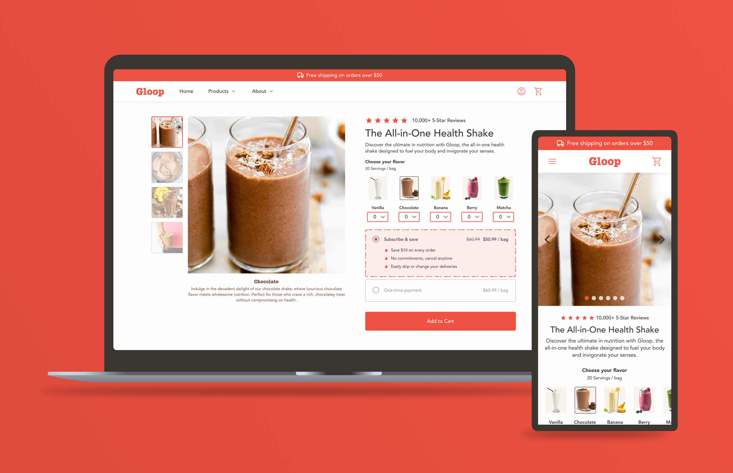
Gloop | PDP Redesign
B2C · E-commerce · Desktop + Mobile
-
![]()
illumi | Collections Page Redesign
B2C · E-commerce · Desktop + Mobile
-
![]()
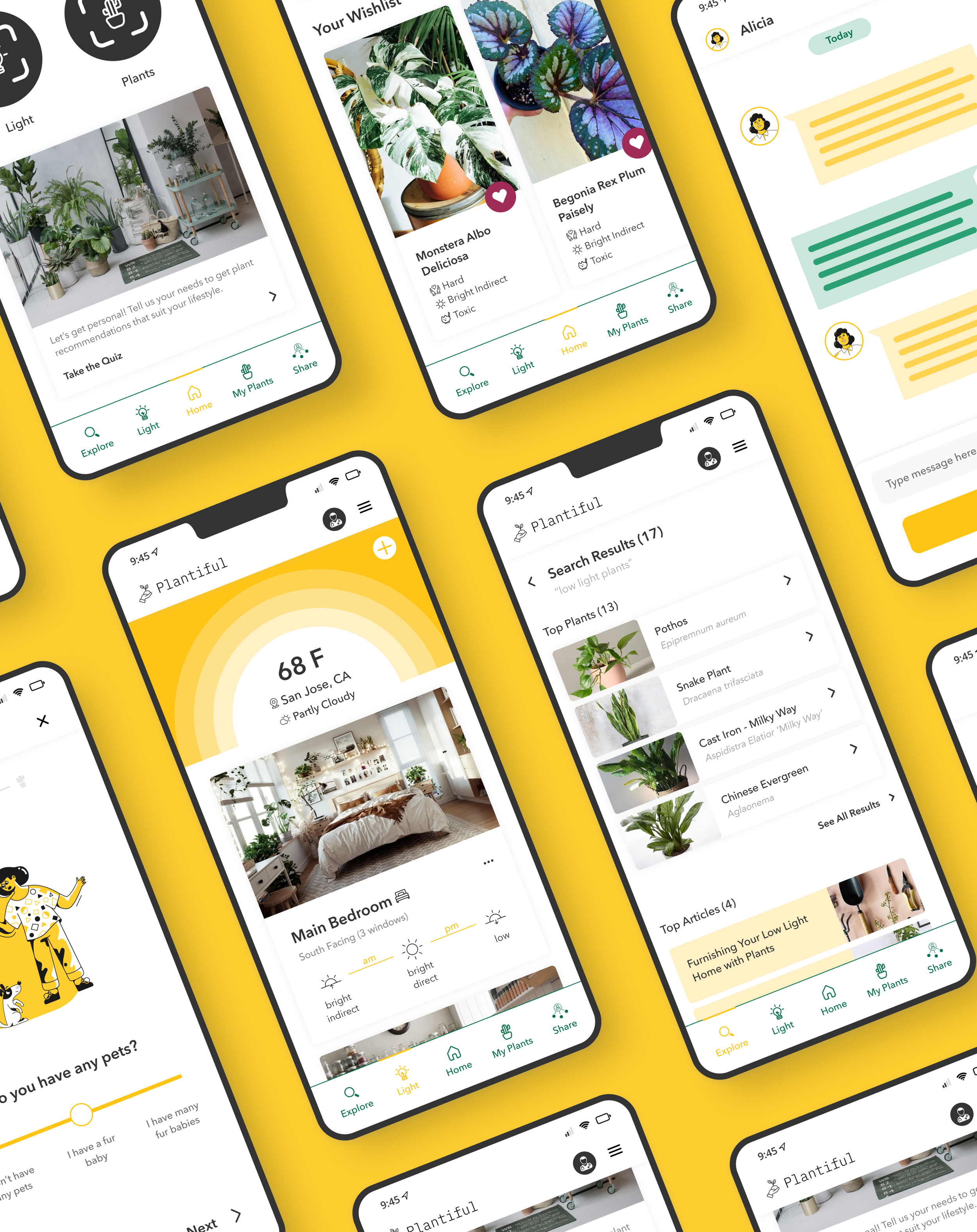
Plantiful | Mobile App (Academic)
B2C · Mobile · UX Research + Product Design